Website Case Study

Absolute Property Inspections

A website that sounds like the person who shows up to do the work

Steve Rodgers runs Absolute Property Inspections in South Florida. He does every inspection himself, so the website is the first version of him a customer meets.

He’d already paid for two websites. When he came to me, the second was about a year old, built by a friend who knew web design but never really asked how the business ran. The new site starts from Steve’s own words and gives people a reason to book with him instead of just a link to a calendar.

“When I read my new site, it’s me. It’s mine. It’s authentic. When people see it, they see me. And then when I show up at their door, they know it’s the guy they saw on the website.”

Steve Rodgers
Residential Home Inspector

Where We Started

Steve had two websites behind him and a reputation as a home inspector that was better than either one. The most recent version had no photo of Steve anywhere on it, and the booking button dumped people onto a Google Calendar. Meanwhile, he had clear, professional branding on his truck and his uniform that were nowhere on the site.

What We Were Trying to Accomplish

The goal wasn’t just a better-looking site. It was making the website people find online match the business Steve actually runs.

  • Put the brand customers already recognize on the website
  • Make the site sound like Steve, since he’s who people are hiring
  • Help visitors trust that he’s the right fit
  • Let someone go from stranger to booked without a phone call in between

Designed with Purpose

Good design isn’t just about making a website look nice. It’s about helping the business behind it work better. Before we design a single page, we get clear on what the site needs to accomplish. From there, every decision is made with those goals in mind.

Here’s a look at a few of the choices that shaped this website.

Click images to view larger

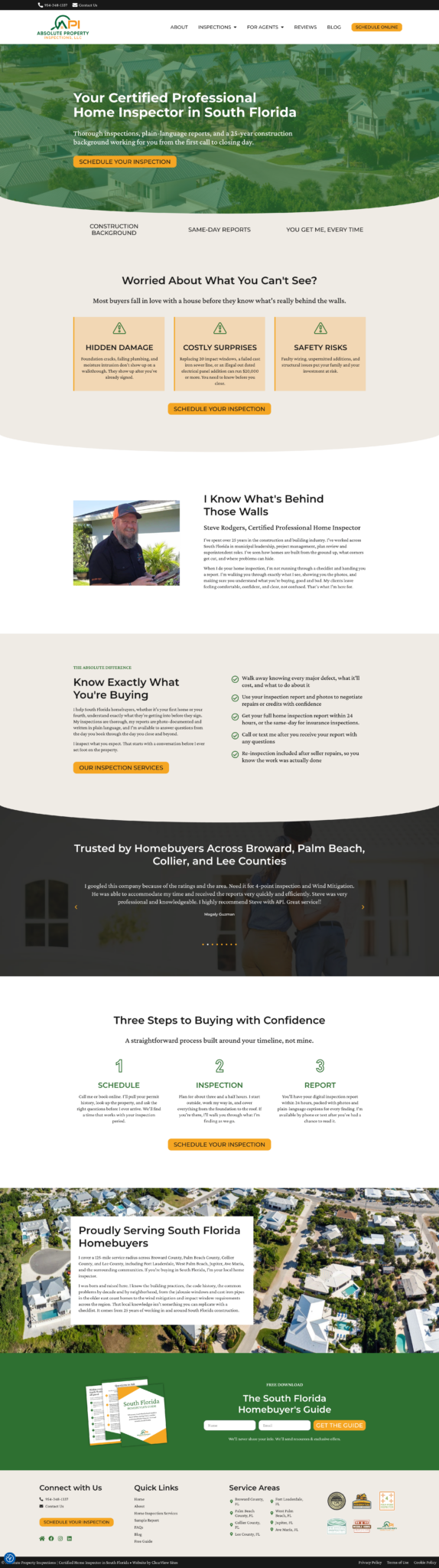
Starting where the customer’s head already is

Most people booking an inspection are worried about something specific they can’t see. The homepage names those worries out loud, hidden damage, costly surprises, safety risks, before it says anything about Steve, then answers them with his construction background. His brand colors, the ones already on his truck and uniform, run the whole page.

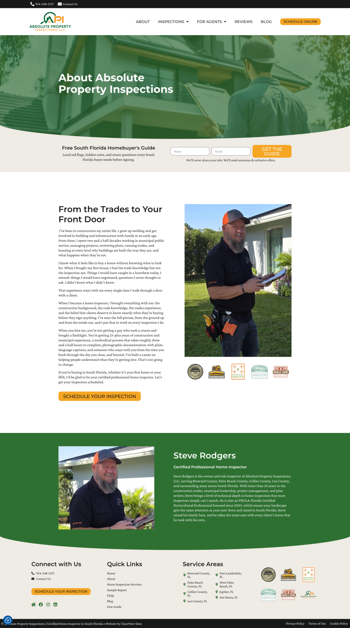
Turning 25 years of experience into a reason to hire him

Steve’s customers are hiring him personally, so the About page gives them him. It runs his own story, including the house he bought before he had an inspector’s eye and the things he missed. That came out of his own stories, so it reads the way he talks. His certifications sit underneath for anyone who looking for those.

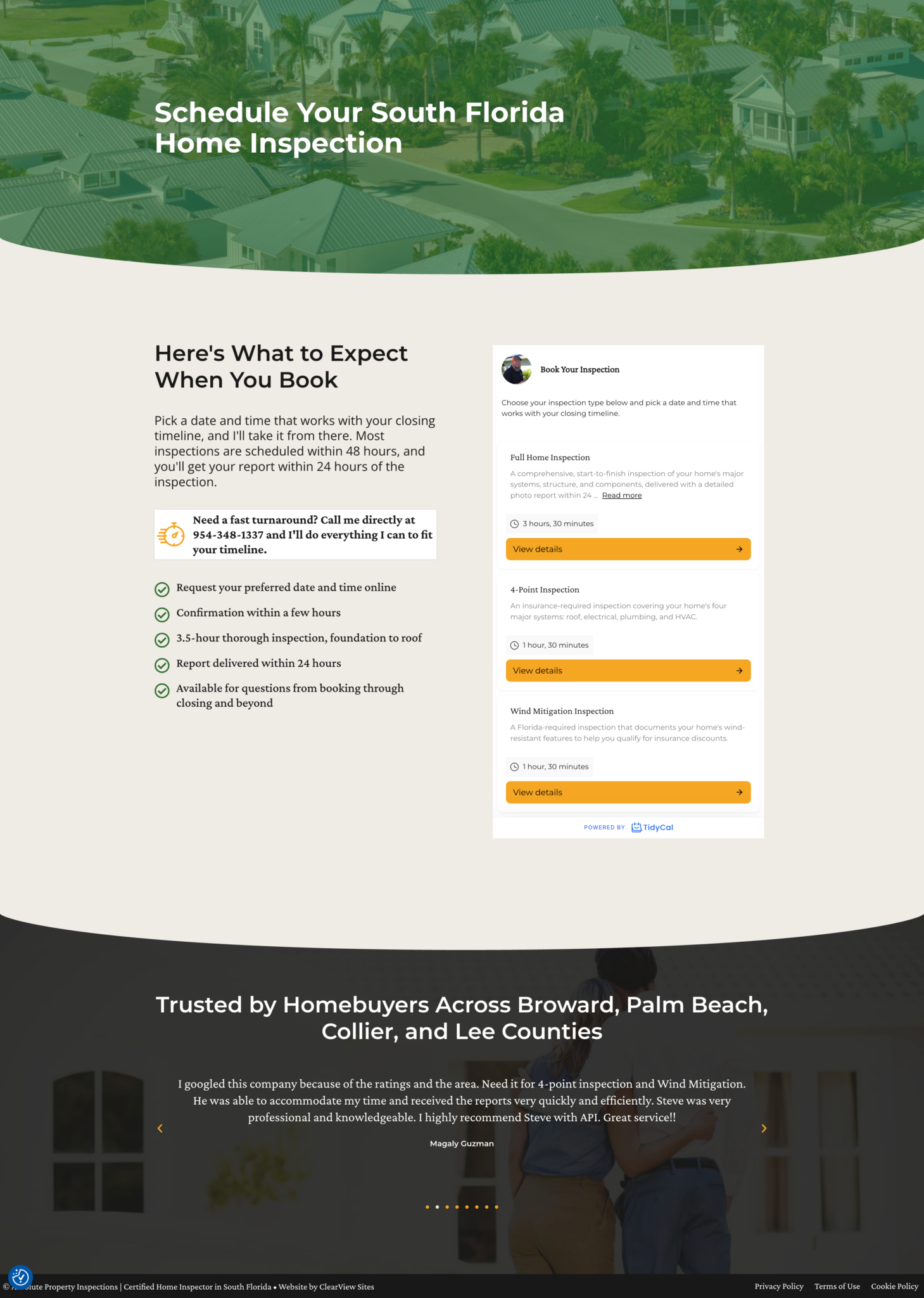
Answering “what happens next” before asking for a date

People stall on booking when they don’t know what they’re committing to. The scheduling page gives the timeline first, scheduled within 48 hours and report within 24 after, lists what Steve does on site, and puts his direct number halfway down for anyone who’d rather just call him.

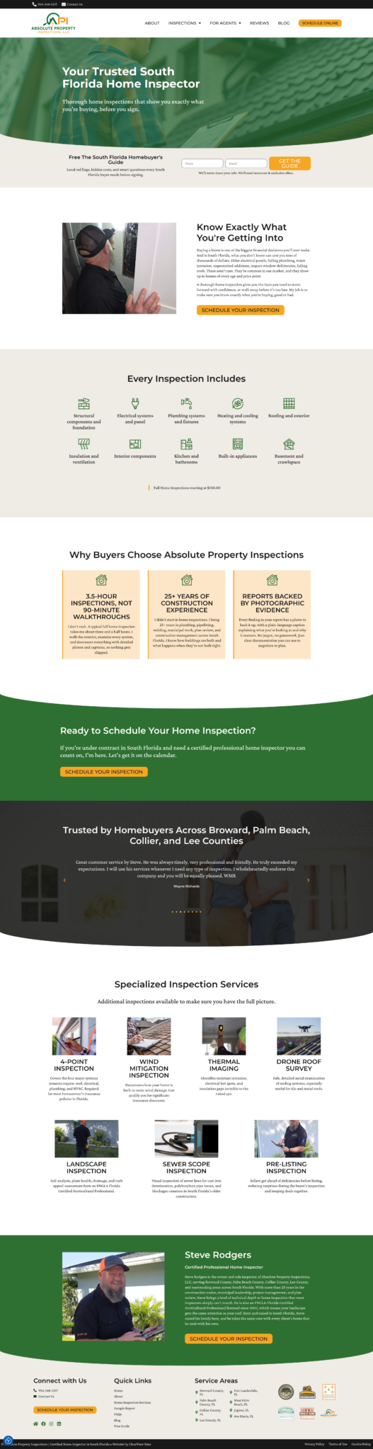
Answering the questions people ask before they hire anyone

Anyone shopping for a service wants the same info: what’s included, will this person do a good job, what does it cost. The services page answers all three in order. Every system covered is listed out, the reasons to choose Steve are specific to him, and the starting price is on the page. Add-on services sit lower down for people who need more than the standard job.

The Finished Result

Steve has a site that matches the business he’s been running all along. It answers the questions people have before they hire anyone, in roughly the order they have them. He can send a lead to it and let it do the explaining, which he couldn’t do with either of the last two.

Someone landing on the homepage now gets the worry named, then Steve’s background, then what an inspection covers and costs, then what happens after they book. By the time they reach the calendar, the deciding is mostly done. He can add blog posts himself, and the site has room to grow rather than needing another rebuild next year.

Steve's Thoughts

“My website was boring, bland, and didn’t hit the people I needed to hit. The guy I hired built my website off and didn’t know the industry at all.

When I read my new site, it’s me. It’s mine. It’s authentic. When people see it, they see me. And then when I show up at their door, they know it’s the guy they saw on the website.

If you’re looking for something genuine that completely represents not only who you are, but your brand and your profession, do it this way. Soup to nuts, do it this way. The continuity, consistency is spot on.”

No two businesses are the same, which is exactly why no two websites should be either.

Ready for a website designed around your business?

Every business has different goals. If you're ready for a website that's built around yours, let's talk.

Explore More Client Stories

Free Website Scorecard

Does your website pass the 3-second test?

Let's find out.

Enter your website URL and get a detailed website scorecard showing exactly what's working and what's costing you sales.

Free. No credit card. Results in 60 seconds.