Website Case Study

AG Lighting Innovations

A website built as well as the lights they sell.

AG Lighting Innovations builds LED lighting for commercial poultry and swine houses, an environment harsh enough that most lighting fails in it. Ten years in, they had the field record to prove their lights last in those conditions. Their website said almost none of that.

Stanton wanted a site that put that track record where buyers could see it, and one his team could keep current as new products launched.

The new site is 100% better. I was looking at the old webpage and thought, oh my heavens, seeing how bad the old one was. It’s no comparison.”

Stanton Lee
Managing Partner, Agricultural LED Lighting Manufacturer

Where We Started

AG Lighting Innovations wasn’t a new business. Ten years in, four core products, around 30 distributors. None of it came through on the website. Stanton had hit the ceiling on Wix, too rigid to customize and too heavy for him to manage himself. Product specs sat in downloadable PDFs, some with outdated images. And the business was widening past poultry into markets the site had no room for.

What We Were Trying to Accomplish

Here’s what we set out to do with the new site:

  • Make the company look as established online as it already is in the field
  • Get product specs in front of buyers without asking them to download anything
  • Put the distributor network back in public view so growers can find their nearest source
  • Build in room for products and markets that don’t exist yet
  • Give Stanton a site he can update himself as new products launch

Designed with Purpose

Good design isn’t just about making a website look nice. It’s about helping the business behind it work better. Before we design a single page, we get clear on what the site needs to accomplish. From there, every decision is made with those goals in mind.

Here’s a look at a few of the choices that shaped this website.

Click images to view larger

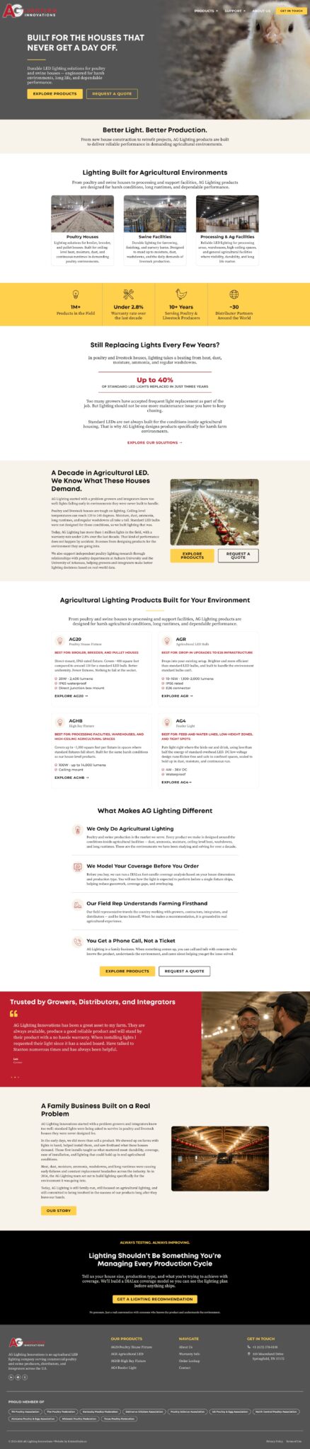
Making the proof the first thing a visitor sees

Stanton had numbers most companies in his market can’t match, and they were nowhere on the old site. A grower who’s been burned by failed lights won’t be moved by adjectives, so we gave the numbers the position adjectives usually get: a band directly under the hero, before any description of the product. Then we named the problem out loud before offering the alternative.

We also split the industries into three cards up top, so the site reads as agricultural lighting rather than just poultry lighting. The old positioning boxed him in, and he has products moving into new markets.

Answering the question every buyer is actually asking

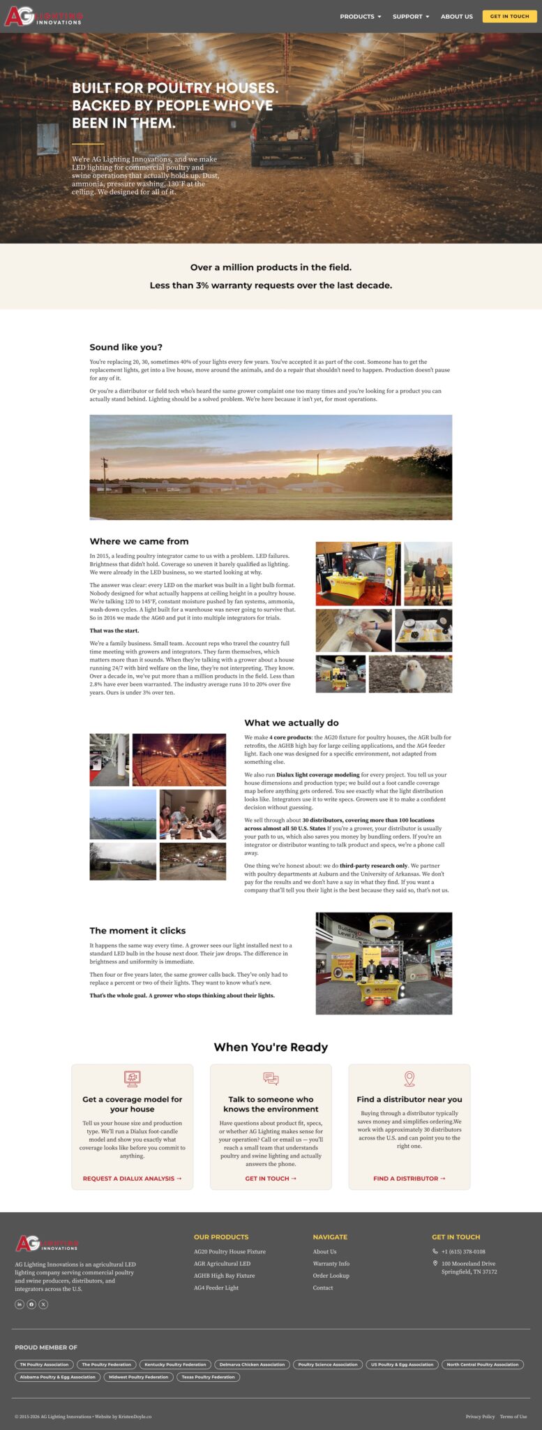
The about page lands in the top five most-visited pages on most sites, and Stanton said he checks it on every site he visits himself. We wanted his to answer what a skeptical buyer is actually asking: do you know my houses?

He had a real origin story to work with, a specific problem in a specific year and a product built because nothing on the market held up, so we ran it as a narrative instead of a company blurb. The third-party research with Auburn and the University of Arkansas sits here too, including the line that they don’t pay for the results. Everything on this page serves to build trust with visitors.

Giving growers and prospective distributors each their own path

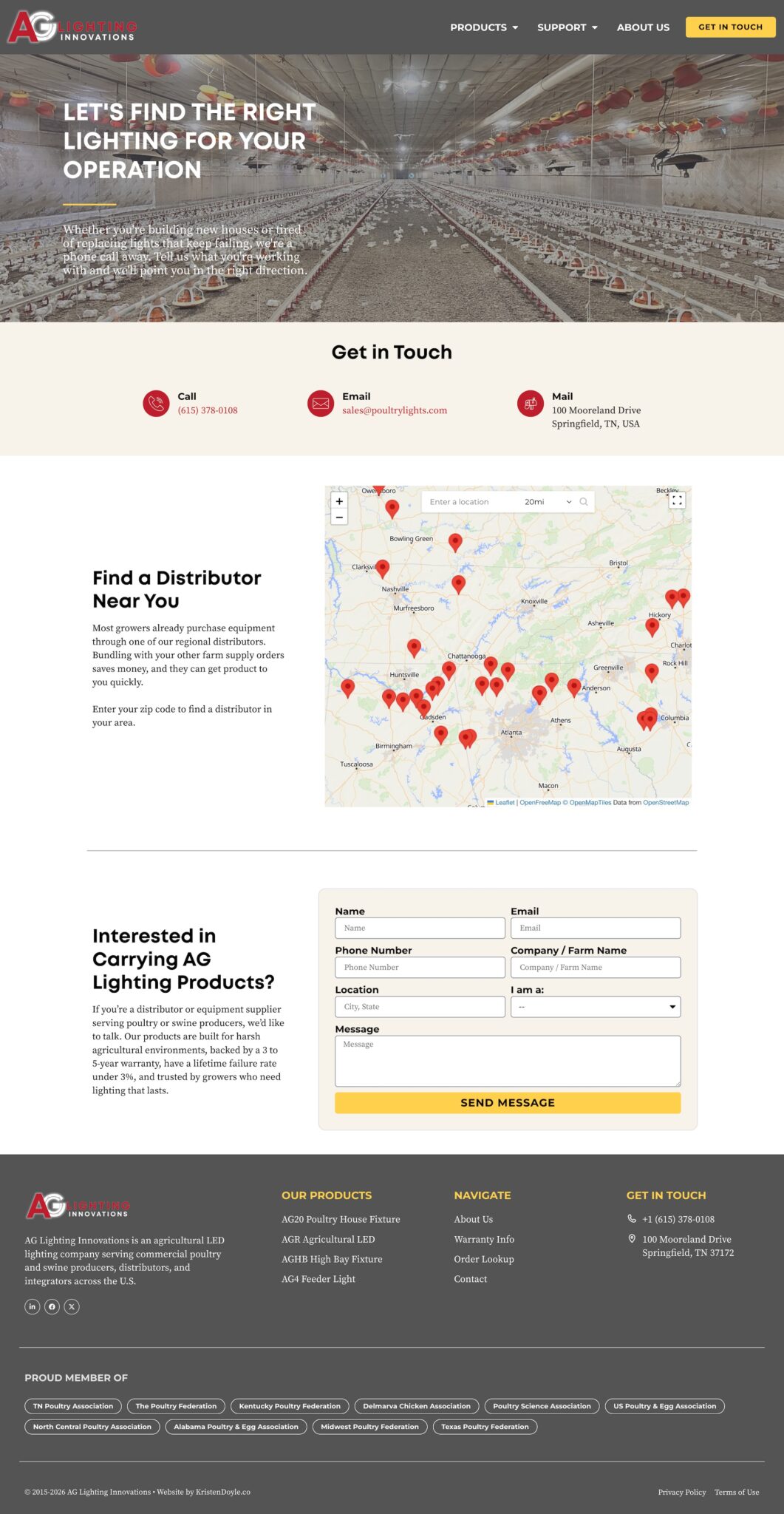
Two kinds of people land on this page, and they need opposite things. Growers order through a local distributor and bundle their lighting with the rest of their farm supply order. Suppliers arriving here are deciding whether to carry the line at all.

So we built one page with two paths: a searchable map up top so a grower can find their nearest source, with the reason for buying that way stated right beside it, and a separate section below for suppliers, carrying the warranty terms and failure rate since those are the numbers that matter to them.

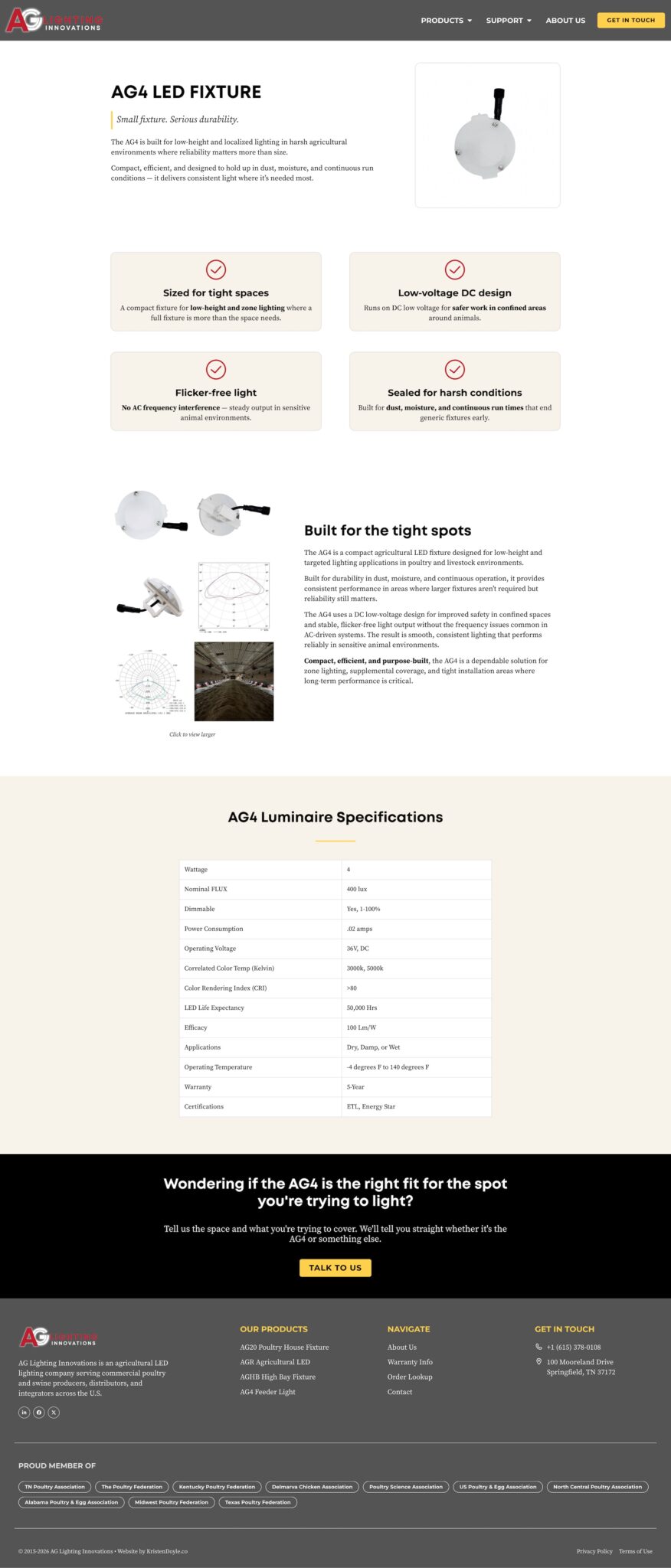
Letting each product make its own case

AG Lighting makes several products, each designed for a different environment. On the old site they were in slides on the homepage with a PDF attached, so nothing helped a grower decide which one is right for their use case. Each product now has a page that argues for itself: its own positioning line, clear photos, the four things that matter most as callouts, then the full specs underneath.

The Finished Result

AG Lighting Innovations now has a site that carries the weight the company has actually earned. The numbers that prove the product are visible in the first few seconds. The people behind it have a page. Growers can find a distributor near them, distributors can find product specs and check their order status, and a farmer with a bad light can file a warranty claim in about a minute. Everything that used to sit in a PDF or behind a wall is now on a page that Google can index and a buyer can read on their phone in the field.

Just as important, Stanton isn’t stuck anymore. He can add new products as they launch. Testimonials can be dropped into a carousel when customers send them in. The blog setup is already there for whenever he’s ready to use it.

Stanton's Thoughts

“Wix’s lack of customization and overall bulkiness was too cumbersome for me to manage personally. I’d heard from multiple people that Wix was limited on the functionality we needed, so I felt it was time to make the jump to better exhibit our company.

I liked the way Kristen approached both the pre-build and build stages with her portal. Kristen does a great job building a high quality website that’s navigable and looks great at the same time.”

No two businesses are the same, which is exactly why no two websites should be either.

Ready for a website designed around your business?

Every business has different goals. If you're ready for a website that's built around yours, let's talk.

Explore More Client Stories

Free Website Scorecard

Does your website pass the 3-second test?

Let's find out.

Enter your website URL and get a detailed website scorecard showing exactly what's working and what's costing you sales.

Free. No credit card. Results in 60 seconds.